The through-line has always been the same: closing the gap between what an organization intends to communicate and how the world actually receives it.


.svg.png)


We're based in the Hudson Valley, just north of New York City, and work with clients locally in Westchester County, throughout the tri-state area, as well as nationally and internationally.
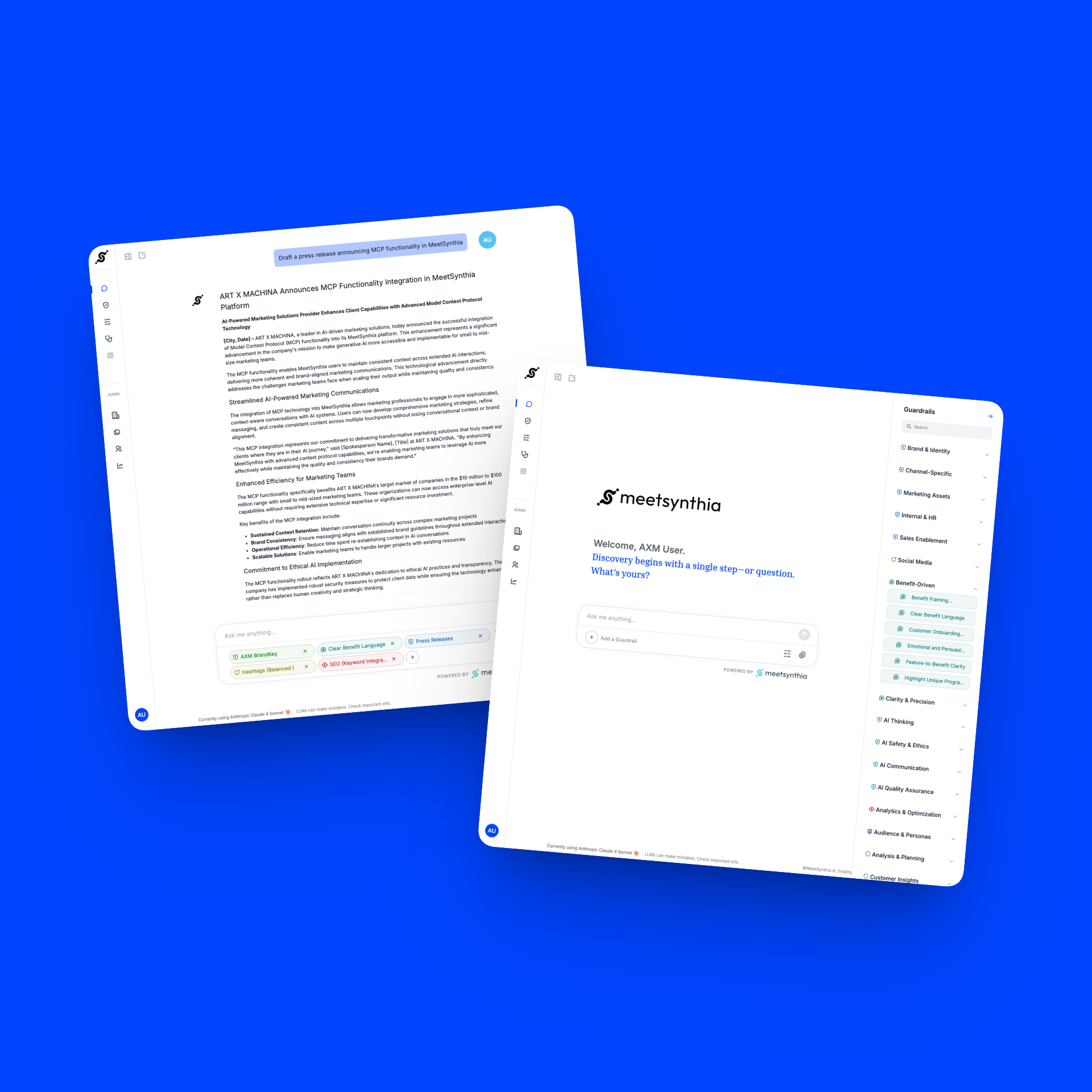
Our work spans identity systems, positioning, packaging, web design, display advertising, and increasingly helping brands develop AI guardrails that protect voice, tone, and accuracy (with Synthia).
We build the foundational elements that define how a brand looks, sounds, and feels.
We create the materials that move audiences from awareness to action.
Platforms built to convert, scale, and grow alongside your business.
We define rules that keep AI outputs on-brand and compliant across AI-generated content.
The work showcased below represents projects led throughout my 25+ year career in design and brand marketing. Recent projects were completed as Mazar Design Group. Earlier work includes campaigns developed while serving as a Creative Lead at Accenture and as Partner at Tenthwave. All represent the strategic thinking, creative vision, and execution quality that define my approach.

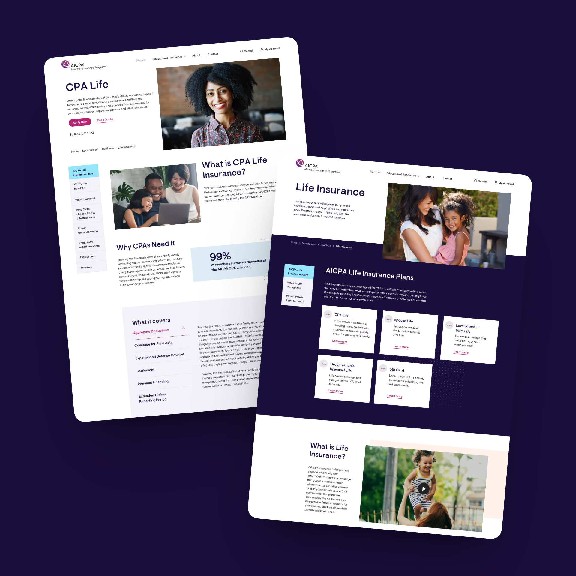
Full-scale branding, marketing collateral, and a website built to drive trust and bring more customers through the door.

UX/UI platform enhancements focused on intuitive user flows, smarter interactions, and a more human-centered experience.

A local web presence designed to feel as welcoming online as it does in person — fully responsive across all devices.

Complete brand identity system from the ground up, paired with a website that captures the studio's creative edge.

Cohesive branding, product packaging design, and a website that communicates clean, effective oral care with confidence.

A responsive website and UX overhaul that makes navigating a beloved food brand feel fresh, accessible, and appetizing.

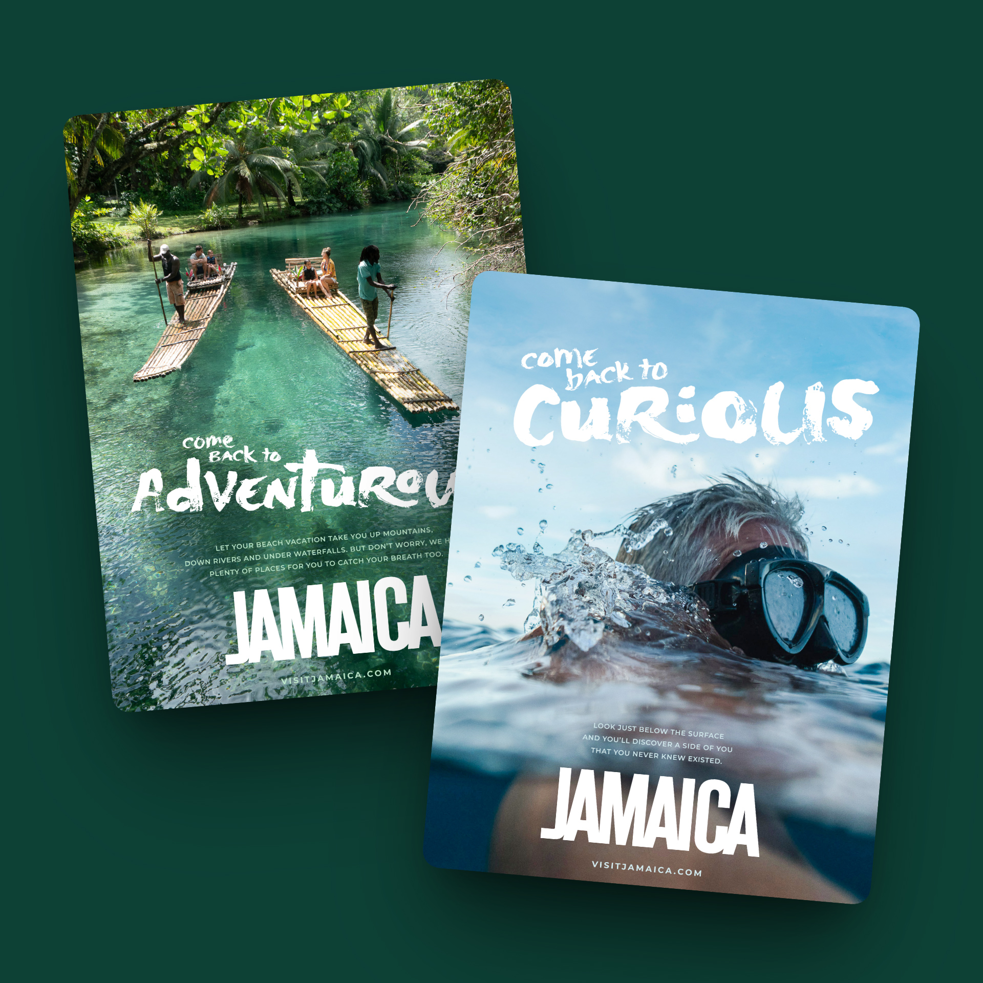
Co-led a global advertising campaign with custom typography and marketing materials that made the island impossible to resist.

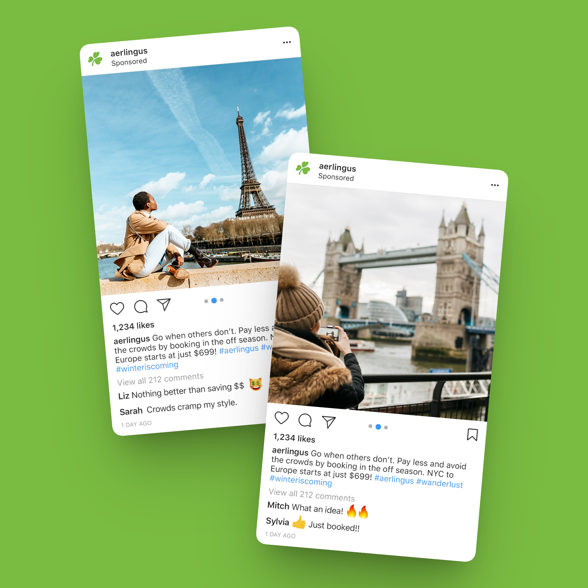
Creative lead for U.S. social and display campaigns — bringing the warmth of Irish hospitality to every digital touchpoint.

CRM and creative lead for Subway's MyWay Rewards launch — built to drive sign-ups, designed to keep them coming back.

An immersive tablet interactive experience blending cinematic design with seamless, story-driven UX.

Creative lead for the responsive redesign of crayola.com — making the path from homepage to checkout as effortless as picking up a crayon.

A search-first website and UX overhaul that turned a legacy baking brand into a daily source of inspiration — and made browsing feel as good as baking.


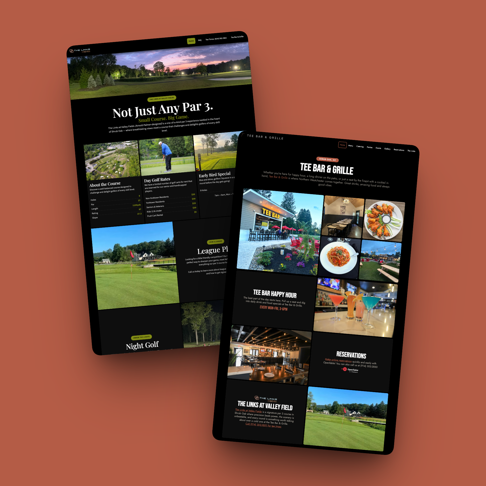
TeeBar & Grille, a charming American bistro nestled on the grounds of anArnold Palmer-designed par 3 golf course in Shrub Oak, NY, needed a modernr efresh of their online presence. The existing site didn't reflect the quality of the dining experience, and the adjacent golf course (The Links at ValleyFields) had no dedicated web presence at all.
We rebuilt the restaurant's website on Squarespace, delivering a mobile-friendly, easily maintainable platform at an efficient price point. Key integrationsincluded OpenTable for online reservations and DoorDash for delivery orders, alongside full dinner, catering, and event menus. Showcasing the food visuallywas a priority, so we incorporated a gallery with fresh photography to elevate menu offerings and highlight upcoming live events. We also created a companion site for The Links at Valley Fields, designed to showcase the beautiful grounds and keep essential course information accessible at a glance.
Two cohesive, inviting websites that give this unique Westchester County destination a unified digital presence, driving reservations, delivery orders, and foot traffic to both the restaurant and the revitalized 9-hole course.


Most businesses exploring AI for marketing and creative work quickly run into the same wall: without proper context, AI outputs require constant re-prompting, corrections, and oversight before they're usable. There was no scalable way toensure outputs reflected a brand's voice, channel requirements, compliance rules, or tone — and the burden of figuring all of that out fell entirely onthe individual user, every single time.With 30 years as a trusted name inplant-based meals, Dr. Praeger's had recently updated their brand identity and packaging. Their digital presence needed to reflect the new direction while solving a core business problem: their products are sold in stores, not online, so the website needed to drive customers to retail locations.
As Partial Owner, Product Design & Guardrail Architect, I recognized Synthia'score technology — a rules-based system that sits between the user and the LLM —as a powerful but underdeveloped platform for marketing and brand creative. The system needed substance: a library of reusable, ready-to-deploy guardrails thatnew users could put to work immediately, without deep configuration ortechnical setup. Working alongside my partner Alex at AXM, we built a libraryof nearly 400 guardrails across categories including Channel, Tone, Brand,Benefit-Driven, Social, and Analytics. We then introduced "presets" —curated groupings of guardrails designed to solve entire workflows out of the box. A CPG brand drafting a press release, for example, can combine a brandguardrail with press release formatting and FDA compliance rules in a single preset, producing on-brand, compliant drafts from the start. Beyond contentarchitecture, my design fingerprints are woven throughout the current product —from UI refinements and admin functionality to client setup flows and overallorganization — all shaped around one principle: deceptively simple, incredibly powerful.
A platform that eliminates the cycle of re-prompting by giving AI the context itneeds to get closer to final on the first pass. New users onboard into arobust, immediately useful system. Clients with specific needs get precision-built guardrail stacks that scale with them. What was once anpromising but bare framework is now a scalable AI infrastructure for marketing teams that want consistent, brand-right output — without making every employee a prompt engineer.


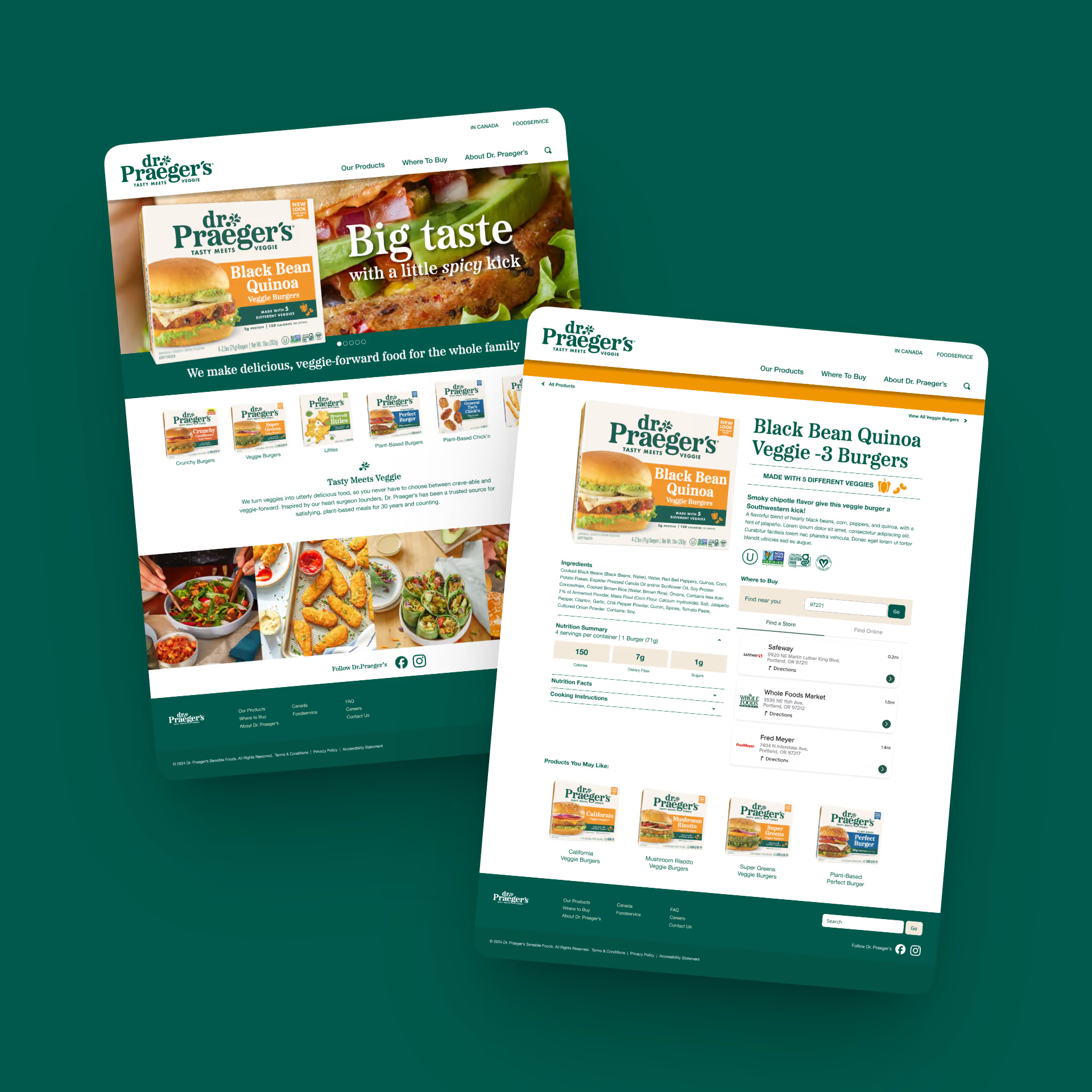
With 30 years as a trusted name in plant-based meals, Dr. Praeger's had recently updated their brand identity and packaging. Their digital presence needed to reflect the new direction while solving a core business problem: their products are sold in stores, not online, so the website needed to drive customers to retail locations.
We designed and built a mobile-first, modular website structured to grow alongside an expanding product lineup. Accessibility was a core focus, with careful attention to WCAG color-contrast standards and inclusive design. We integrated a "Where to Buy" store locator directly into each product page, partnering with the Where to Buy platform to connect digital browsing with in-store purchasing.
A vibrant, accessible online experience that transforms individual product pages into conversion tools, helping customers find and buy Dr. Praeger's products at nearby grocery stores and online retailers, while bringing the energy of the refreshed brand to life.


PeriActive, a botanical-based oral care brand in Israel, needed a complete brand refresh, starting from the ground up with a new logo, visual identity system, and product packaging that could compete on-shelf and across digital channels.
We developed versatile logo marks optimized for both print and digital applications, including tailored versions for social media, an all-caps treatment, and a lighter-weight variation. Two distinct brand directions were explored and put through rigorous user testing before a final direction was selected and fully realized. From there, we designed bottle label comps that brought the new identity to life on-shelf, creating static mockups used in consumer testing with a third-party research partner. Once the winning direction was validated, we produced print-ready label files, working closely with the print vendor to meet exact production specifications.
A comprehensive newbrand identity (from logo system through packaging and brand guidelines)validated by consumer research and production-ready for market. The final brand guidelines document ensures consistency across all future touchpoints as PeriActive grows.


After years of reduced international travel, Jamaica needed a global advertising campaign that would reignite interest in the destination — not just as a place to visit, but as an experience that reconnects travelers with a sense of adventure, curiosity, and joy.
We developed a campaign concept rooted in a simple, resonant idea: it's time to come back; not just to a destination, but to the best version of yourself. The campaign positions Jamaica as a place to rediscover what we lost during years of not traveling: adventure, curiosity, romance, and that feeling of being fully alive. Central to the creative was the development of a custom typeface we named "Curious," designed toevoke a sense of wonder and complement Jamaica's vibrant photography with the island's unmistakable personality and charm. We crafted lockups for 35 English headlines and translated them across eight additional languages for a trulyglobal rollout. The campaign spanned display ads, commercials, posters, and more…the full gamut of touchpoints to reach travelers worldwide.
A warm, inviting global campaign that makes you feel something before you've even booked the trip. The custom "Curious"typeface gave Jamaica a distinctive visual voice across all markets, and the multi-language rollout ensured consistent brand presence across nine languages and dozens of international markets.
Project completed as Co-Creative Lead at Accenture


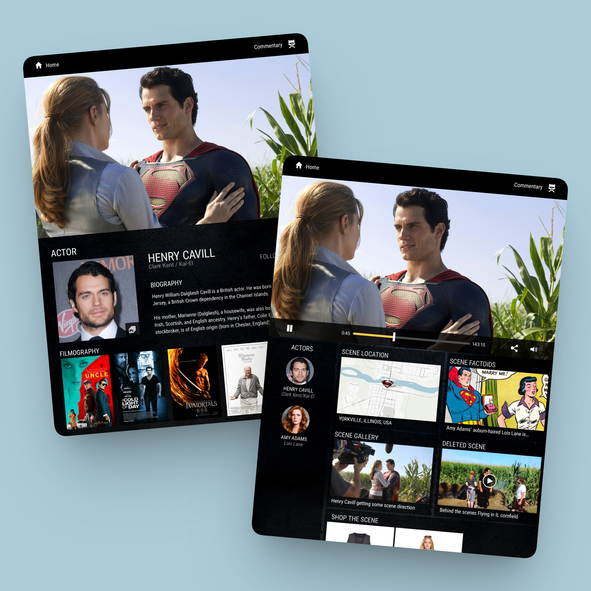
WarnerBros. had developed a set-top viewing experience that let users access bonus features tied to on-screen moments, but the interface was limiting and cumbersome. As the focus shifted to tablet, they needed a completely reimagined UX — and invited multiple agencies to compete for the project.
The solution beat out five leading creative agencies by fundamentally rethinking how viewers interact with bonus content. By leveraging the tablet's gyroscope and accelerometer, we created an intuitive, behavior-based interaction model where simply rotating the device to portrait mode activated live in-scene extras — without ever pausing the movie. This eliminated the need for a second screen entirely, keeping viewers immersed in the film while exploring rich bonus content. The multifaceted extra materials were presented through a scalable design system built to accommodate a growing library of features across Warner Bros.' film catalog.
A streamlined, next-generation viewing experience that felt as natural as turning a page (selected over five competing agency proposals). The behavior-based interaction model set a new standard for how studios deliver bonus content on tablet, keeping viewers engaged with the film rather than pulling them out of it.
Project completed at Tenthwave


Two specialized businesses — a high-end vehicle storage facility and a premium detailing operation — were merging under new ownership. The opportunity: one roof, one team, one brand. The challenge: build an identity that could carry both worlds without diluting either.
The brand needed to speak to discerning collectors trusting the facility with seven-figure machines — and to enthusiasts who came up in real car culture. Premium without being precious. Polished without losing the street.
It also needed to launch fast. New ownership, new signage, new website, new everything — all before the doors opened under the new name.
We started with positioning. "All-In-One" wasn't just a name — it was the promise. One relationship, every service, zero compromises. Every decision flowed from there.
The identity is built on an A1 monogram: a bold gold "A" for the apex, a chrome speed-stroke "1" for forward motion. Black foundation. Gold accent. Chrome detail. The result reads luxury atelier and performance garage at the same time.
From the mark, we extended outward. A full type system in Barlow Condensed. A four-pillar voice framework — Precision, Prestige, Protection, Ownership — that gave the team a shared language for every touchpoint. A complete brand standards guide so the identity stays sharp as the business grows.
Then we built the rest. Website architecture in Webflow with standalone pages for Services, Storage, and Detailing — reflecting the reality that each is a destination in its own right. Business cards, flyers, signage, and social templates rolled out from the same system.
A unified brand that holds its own next to the vehicles it serves. The new identity launched across web, print, and physical signage in lockstep with the facility's debut — giving the new ownership a credible, cohesive presence from day one.
More importantly, we delivered a foundation. The brand book, type system, voice guide, and component library mean every future piece — every social post, every new service line, every expansion — extends the same identity rather than fragmenting it.
The work positions All-In-One Automotive where it belongs: the destination in northern New Jersey for owners who want their machines treated with exceptional skill and absolute respect.


Aer Lingus needed to drive brand awareness and bookings among American travelers for routes to Ireland and destinations acrossEurope; in a crowded airline advertising market where most messaging blends together.
We developed two playful, concept-driven campaigns designed to break through the noise of typical airline advertising. "Go When Others Don't" spoke to the savvy traveler who craves authenticity over tourist traps — promising theLouvre without the lines, Barcelona without the bull, and Piccadilly without the circus. "Treat Yourself" took a cheeky, lighthearted approach, positioning a European getaway as a well-deserved reward — just popping out forItalian or a lovely cup of English tea, but on the other side of the Atlantic. Both concepts leaned into wit and personality to make Aer Lingus feel approachable and distinctly fun.
Two resonant campaigns that reinforced Aer Lingus as the smart, affordable gateway to Europe for American travelers. The playful tone and concept-driven creative carved out a distinctive brand personality in a market dominated by generic aspirational messaging.
Project completed as U.S. Creative Lead at Accenture with Rothco inDublin


Lipsum
Lipsum
Lipsum


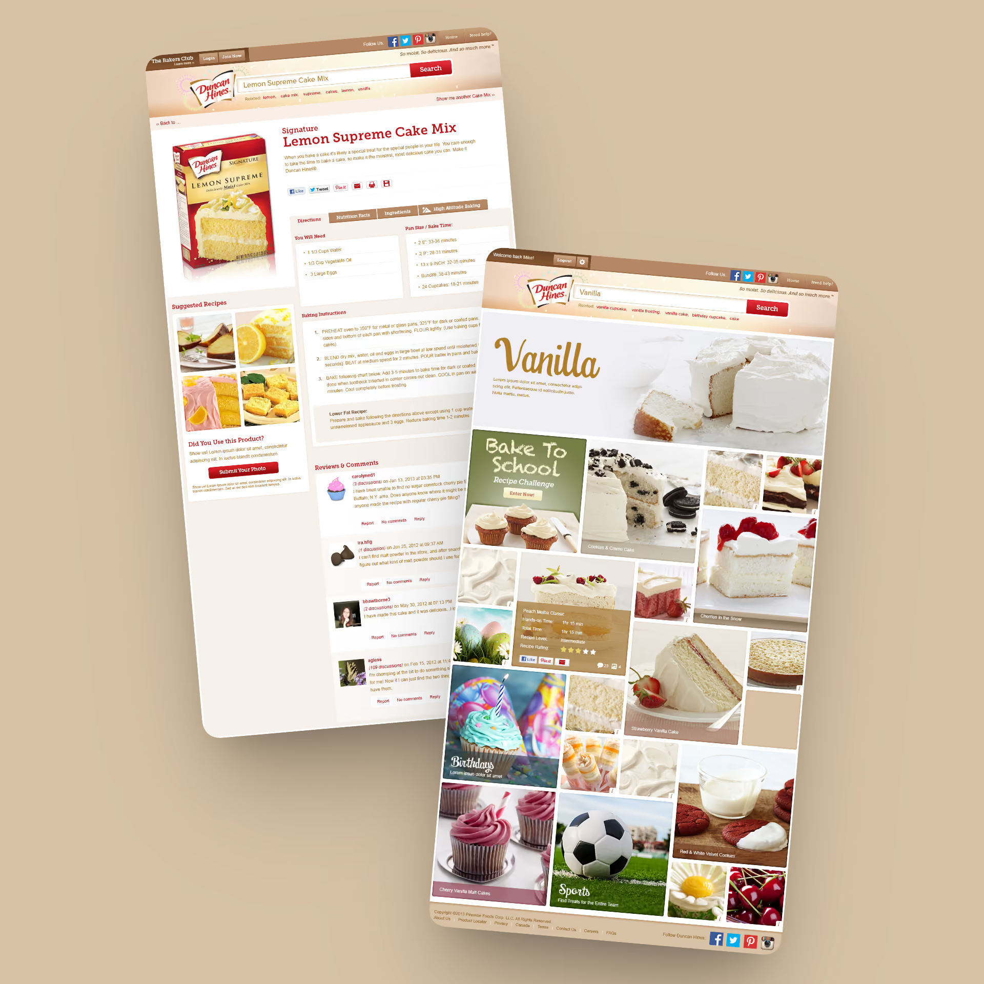
In 2013, every CPG website looked the same. Top nav, product grid, recipe section, store locator. A digital filing cabinet with a logo on top.
Duncan Hines wanted to lead the category online, not blend into it. The brand needed a digital experience that did more than house recipes — it needed to give bakers a reason to come back. And we needed to know what that reason actually was, not guess.
We surveyed over 1,000 bakers before designing a single screen. One thing kept coming back: bakers don't go to a brand site to look something up. They go looking for an idea. A reason to bake. A spark.
That insight reframed the project. If bakers come for inspiration, a traditional menu is the wrong tool for the job. Menus assume you know what you want. Inspiration is the opposite — you know it when you see it.
So we built a site with no navigation beyond a search bar.
The organizing units were "Inspirations" — about 100 at launch. Not categories like "Cakes" or "Cookies," but moments: Birthdays, Strawberry, Bake Sales, Date Night, First Homerun, Fourth of July. The things bakers actually bake for.
The platform combined Pinterest-style visuals with predictive search. Type "strawberry" and the page filled with strawberry recipes, strawberry products, and strawberry-adjacent moments you weren't thinking about — shortcake to Mother's Day brunch. Content built cumulatively as bakers browsed and refreshed as they searched. Recipes were grouped by shared characteristics, so search kept triggering unexpected connections. Come in looking for a birthday cake, leave with three ideas for a bake sale you hadn't planned yet.
We tested the concepts across five baker segments before launch. It held up.
Bakers Club membership grew 35%, to 357,000. The site became the brand's content engine and reshaped how the team thought about digital — less catalog, more conversation.
It also picked up some hardware:
One Show Merit Award — User Experience Design
One Show Finalist — Design Craft
WebAward — Food Industry Standard of Excellence
Gold W3 Award — Food and Beverage
Silver W3 Award — Visual Appeal
Silver Davey Award — Food & Beverage
Gold Horizon Interactive Award — Restaurant/Food Industry
The breakthrough wasn't the predictive search or the visuals. Both existed. The breakthrough was trusting the research enough to throw out the menu — and building the site around what bakers actually came for.


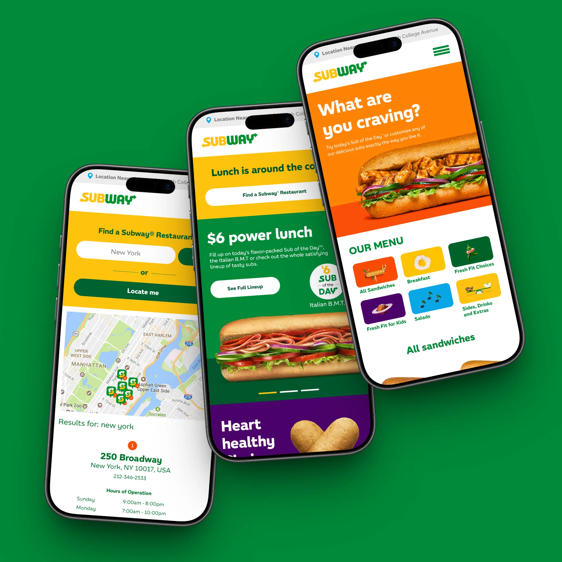
Subway was launching MyWay Rewards across 28,500 restaurants in North America. The program promised personalization, flexibility, and a few surprises. Our job was to get customers to sign up and keep using it.
There was a wrinkle. Subway had just gone through a brand refresh from another agency, and the new color system wasn't translating to digital. The incumbent was letting it slide. That gap became our opening.
We led with the CRM work first. DTC emails through Adobe Campaign Manager that announced the program, explained the mechanics, and made signing up feel easy. Every send had a job: introduce the program, drive enrollment, or get someone back in for their next token.
While we were building those out, we took the brand-to-digital color compliance problem off the client's plate. Nobody asked us to. We just did it. That work earned the trust to pitch a full site redesign — the comps shown here.
The CRM program ran for years. The site pitch was strong enough to resonate with the client, but not strong enough to unseat the incumbent. We didn't win that one.
What we did win mattered more. The original pitch was so strong it became part of the story that led to our acquisition by Accenture.
Loyalty programs live or die on whether the first email actually gets opened. Ours did.


Crayola.com is one of the most recognized brands in the world walking into one of the highest-stakes corners of its business — e-commerce. The existing experience hadn't kept pace with how customers actually shopped: navigation was dense, product discovery took too many steps, and checkout pushed buyers through a flow that left too much room to abandon. For a brand that lives in homes, classrooms, and on refrigerators across the country, the online experience needed to feel as effortless and joyful as picking up a crayon.
As Creative Lead, UX/UI & CX, I led the redesign across the full purchase journey — homepage, category, product, and checkout — building a responsive system grounded in e-commerce best practices and Crayola's visual personality. Discovery was restructured so customers could find what they came for and stumble into what they didn't. Category pages gained clearer filtering, better hierarchy, and product cards that put price, rating, and "Add to Cart" right where the hand expects them. Product detail pages were rebuilt around the decisions customers actually make: gallery first, key info second, supporting content earning its way in below. Checkout was rearchitected from the ground up — collapsed into clear, sequential steps with a persistent order summary, edit affordances at every stage, and a single confirmation screen that removed the guesswork before submitting. Color, typography, and spacing kept the Crayola personality intact without crowding the work the page needed to do.
A responsive e-commerce experience that respects the brand and the buyer in equal measure. Shoppers move from homepage to confirmation with fewer roadblocks, clearer signals, and a checkout that earns trust at the moment it matters most. The site looks like Crayola, but works like e-commerce should.